Deliverable
Market Study
Executive Brand Workshop
Brand Strategy
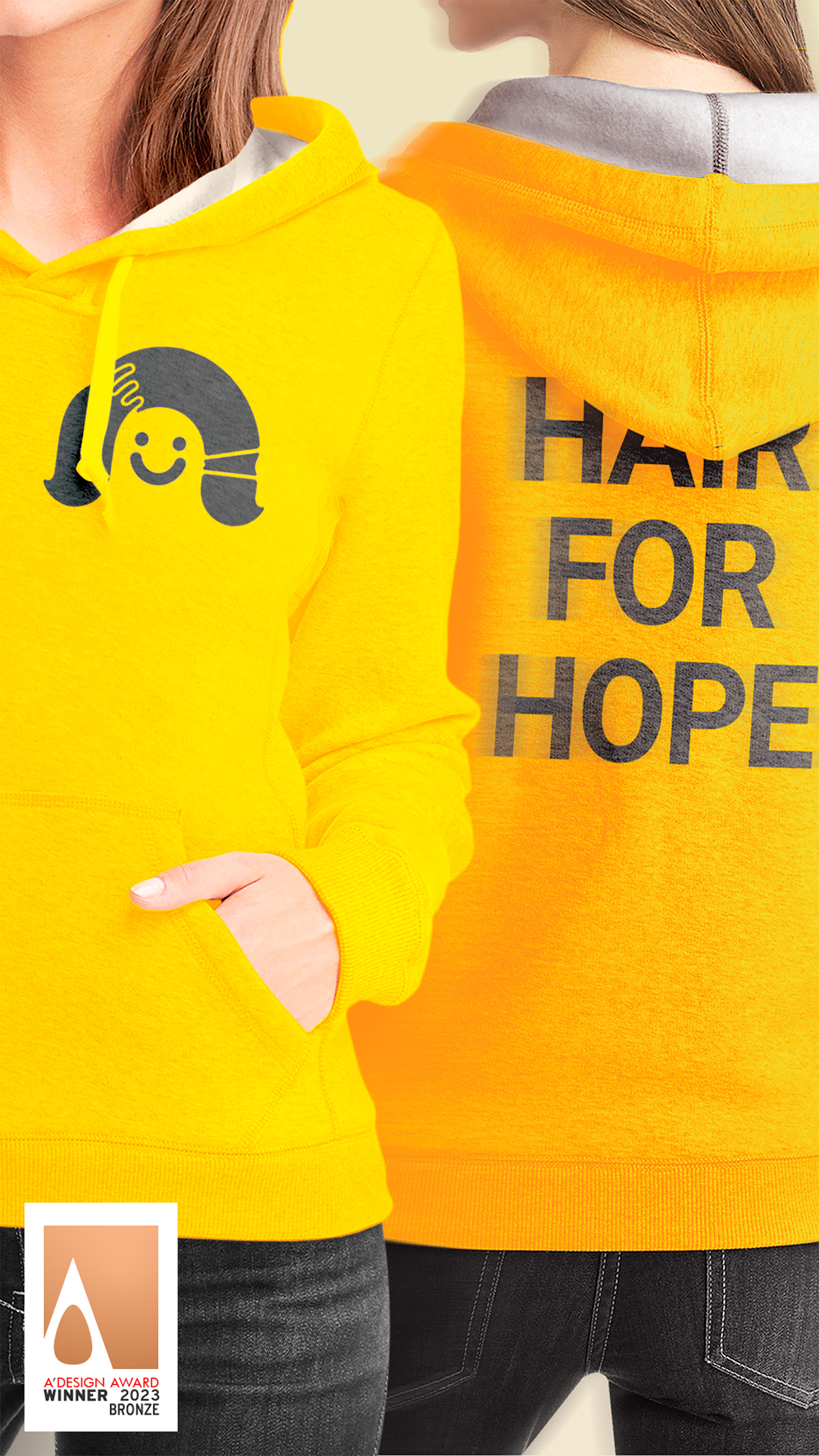
Initiative Visual Design
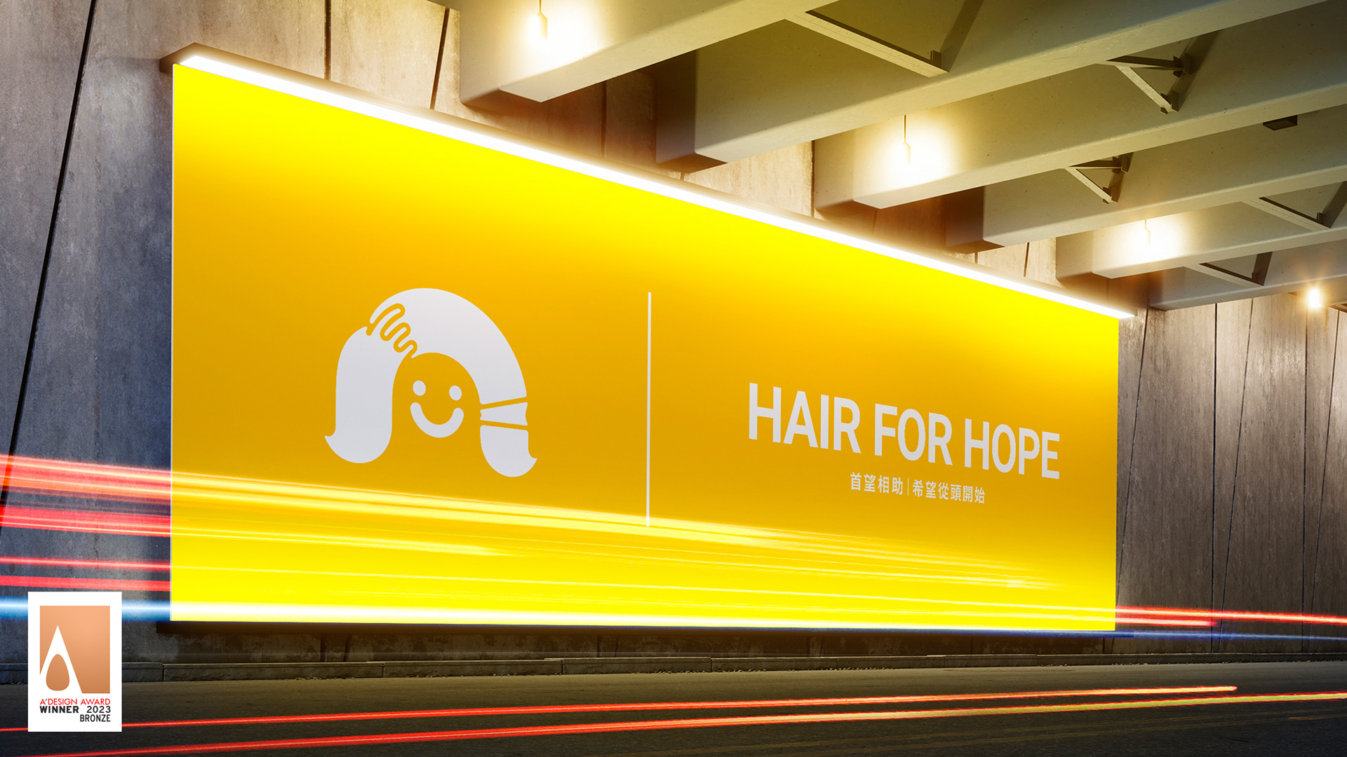
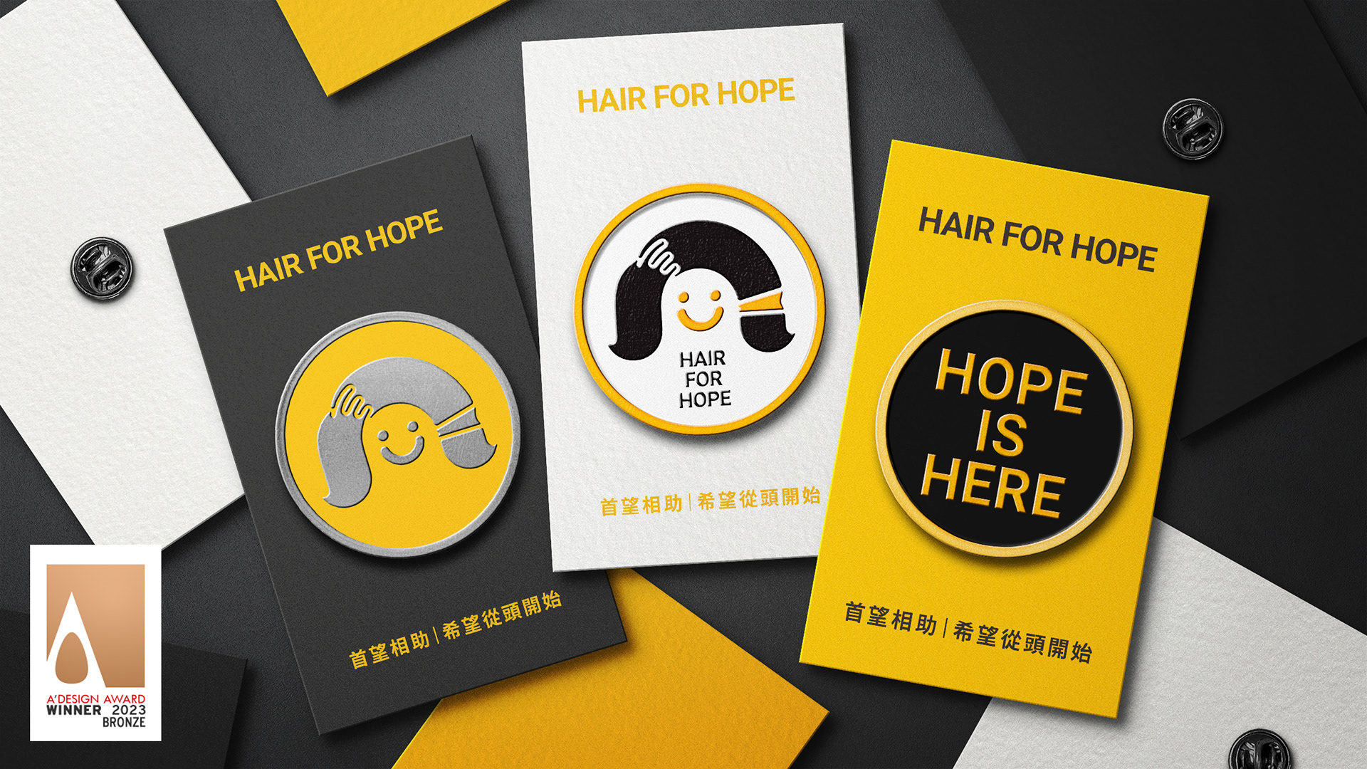
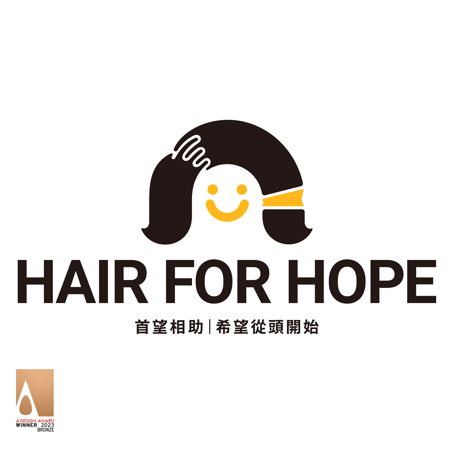
Hair for Hope is a hair donation charity event initiated by the "HOPE Foundation for Cancer Care" for cancer survivors. It is most influential in educating young adults about doing public good and needs an equally distinctive identity to convey its purpose. The identity will become a symbol of call-to-action for cancer survivors to share their experiences and the younger generation to act and make ripples of impact for society's benefit.

The Challenge: How might we create an initiative that elevates public recognition and participation.
This initiative consists of branding processes with a mix of qualitative methods including IDIs, workshop facilitation, design-thinking, and agile management to effectively bring consensus across top management.
We started with creating a symbol that would sing the spirit of this event. The symbol builds on two essences of the event, helping the needy by donating their hair and the joy of cancer survivors to live confidently. The design conveys simplicity but clarity to the event's spirit. Future management and implementation of the identity have also been taken into consideration. Therefore, it is also with the simplicity of design and a well-organized system that the foundation, without in-house design capability, will be able to adapt and apply this identity autonomously and consistently.
The Solution: Create as we would a consumer-facing brand identity that resonates with public value and can be operated autonomously by the internal team.
The construct of the symbol is called "Halo of Hope," which is two half circles united. It symbolizes the commitment of the foundation towards cancer survivors, translated into a rainbow, a sign of promise; and the smile of the individuals receiving care services as they can live confidently again. The halo keeps the design in a balanced geometric space, raising the design's sense of trustworthiness and community.
The color choice of this design reminds the participants of the essential requirement that their hair should remain natural, not dyed or in any other way treated. In addition, a two-color palette makes the symbol easy to recognize in different environments and is also managed by the team. It minimizes the complexity in production, K100 and a single Pantone swatch make color correction simple and consistent across collaterals.

In terms of brand strategy and design, it is to get the consensus of the management team, some of which are cancer survivors, some of which are of medical background, and each had a different view on how the brand and the initiative should be presented and carried on in the future. However, through a successful workshop, the team was able to re-focus and collectively (re)created HOPE Foundation's brand purpose, which will be the North Star to all decision-making on all matters.